Hardware Pixel and CSS Pixel

Definitely, high-density displays affects the way we see Hardware Pixel and CSS Pixel, let’s understand how to use device pixel ratio (DPR) to calculate pixels conversion, and how it improves the web page quality.
Have you ever heard the expression “a pixel is not a pixel” ?
Should designers and developer be worried about how convert css pixel into hardware pixel ?
In earlier days, when high-density or retina displays weren’t a thing, developers and designers used to have a clear concept of pixel:
1 CSS pixel was exactly the same as 1 hardware pixel, simple like that.
.box { width: 200px; }So these 200 pixels defined in the CSS file were actually mapped to 200 screen pixels.
Nowadays, high-density displays have become a trend and almost a pattern for most modern devices, we use pixel ratio as a new multiplier. It determines how many hardware pixels map to a single CSS pixel.
If neither all displays have the same pixel density and all pixels are equal, that’s why we can strongly affirm that a pixel is not a pixel at all.
Web Pages Quality
High-density displays make your resolution and pixel density a lot higher.
Devices add more small points around a defined pixel to improve your page quality.
The pixels are dense and packed together that it looks a lot smoother, that’s the whole idea behind retina displays and pixel density.
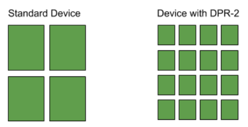
As you can see in the image below, these 3 images are represented by the same amount of CSS pixels. However, there is a conversion process happening behind the scenes, it converts software pixel into physical pixel based on the device pixel ratio.

Let’s see how this process works, describing the 3 different types of pixels.
- Hardware Pixels (physical pixels) which are the pixels that are actually on the devices.
- Device Independent Pixel (DIP) which is a unit of measurement that actually relates pixels to a real distance, it groups physical pixels together.
- CSS Pixel (software pixel) is just a unit of measuring used to position elements on screen, it’s uses the viewport as reference, doesn’t matter how many pixels there are per screen.
Looks like Device Independent Pixel (DIP) and CSS Pixel are the same, doesn’t it ?
Actually device independent pixels are not relevant to the web platform. But the behaviour of CSS pixels is similar to DIP in mobile platforms.
The browser reports the width in the number of device independent pixel (DIP) and not the hardware pixels, it takes up the same amount of space on a display, doesn’t matter the pixel density of the display.
Device Pixel Ratio (DPR)
The device pixel ratio is the ratio between device independent pixel (DIP) and actual the physical pixel on the screen.
If there are twice as many hardware pixels across as there are pixels on the browser, the hardware pixel must have a device pixel ratio of two (DPR-2).
Imagine if your web page loads on a device that has a DPR-2.
This device will convert 1 CSS pixel into a 4 hardware pixel.
What does it mean in the programming language (CSS pixel) ?
Device adds 2 extra wide and tall hardware pixels, it displays more points to make that area bigger improving the quality of the element.
Take as an example the CSS pixel below applied in a device with a device ratio of 2.
.bar {
   width: 2px;
   height: 2px;
}
This is clearly noticeable the amount of small points created around of the defined point.
The second element is rendered using more details to fit into the same area size, considering that this element is an image, the quality visualised in the second example will be a lot better.
Calculate Pixel
Let’s see how we can convert these hardware pixels into CSS pixels.
This technique is common between designers and developers to define real breakpoints and manage better the images resolution.
We can use this simple formula to do it.
Software Pixel = ( Hardware Pixel / Device Pixel Ratio )
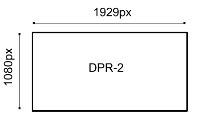
Let’s assume that your boss requested you to create a web page for a specific device, the resolution of this device has 1929px X 1080px and a pixel ratio of 2.

1920 hardware pixel / 2 device pixel ratio = 960 software pixel
You will be defining your breakpoint width as 960px in your CSS file.
To work properly our media query has to reference CSS pixels, it means that 1929px become 960px respectively, these CSS pixels are reference pixels to developers set elements position on any device screen.
Conclusion
Developers and designers always have to keep in mind the difference between physical and software pixels, not always a device pixel resolution screen will represent your responsive pixel design in the web page.
It is quite transparent for us considering that the whole transformation happens behind the scenes, and how DPR of the devices are important to load high quality content.


